With data, numbers can’t speak for themselves

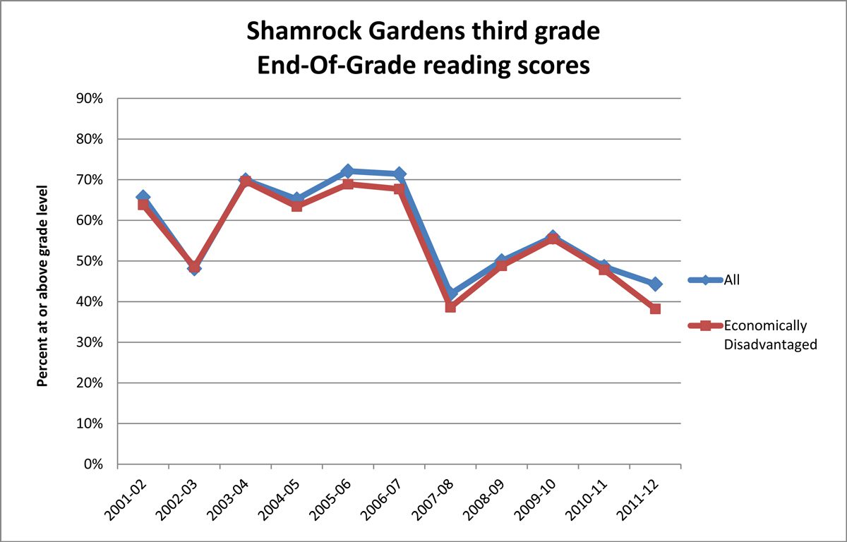
In 2007, Shamrock Gardens Elementary in east Charlotte was showing big improvements, and after years of being listed as a school that could be taken over by the state for low performance, it was close to coming off that list. Then suddenly test scores plummeted (see first graph below). What happened? A new principal? New curriculum? Doubling of class size? A complete failure of school culture?
Nope. End-of-grade tests were re-normed.*

If you were to look beyond the scores of Shamrock Gardens Elementary School and schools throughout the district, you would find the same pattern statewide (see graph below). Plummeting test scores were not a sign of school failure but a sign of changes in state tests.

In this case, letting the numbers speak for themselves would cause schools to make dramatic reforms to improve achievement. Yet, what many schools needed to do was stay the course. In this case, and in most situations, the statistics weren’t telling the full story. What was needed was on-the-ground information and a broader context.
Despite the ever increasing volume of data in our society, data cannot stand alone. Also needed are explanation, context and familiarity with methodological issues. More important, it takes time and expertise to translate information into knowledge and knowledge into action.
This is especially a problem in educational research (and educational commentary, which is often passed off as research), which is littered with examples of methodological issues and data that are useless or even harmful, without context and explanation.
In addition to the re-norming of test scores, these graphs highlight a few common methodological issues. One is the use of longitudinal (or long-term) comparisons across grades. The 2002 class of third graders is different from the 2003 class of third graders. So comparing the two classes’ test scores is not an equal comparison. Yet, such comparisons are made in almost every discussion of school and teacher quality. A more accurate comparison would be to use cohorts, comparing the 2002 third graders to themselves as fourth graders in 2003, and so on.
A second concern is the groups being compared – economically disadvantaged students (students who qualify for free/reduced lunch) and all students. The specific group singled out in these graphs (economically disadvantaged) is also part of the comparison group (all students). This comparison is common but can be misleading when it is not clear how much of the overall population is represented in the subset. Looking back at the first graph, there is little difference between the performance of students who are economically disadvantaged and all students, which would lead you to think economically disadvantaged students at this school are performing on par compared to other students. However, in the case of Shamrock Gardens, the two groups are nearly synonymous; economically disadvantaged students make up the great majority of all students there (upward of 90 percent in the past 10 years). In this case, a better comparison would be to compare third-grade End of Grade scores for students who are economically disadvantaged to scores of those who are not.
Another related example is the common comparison of schools based on Title I status. Shamrock Gardens is a Title I school (a federal distinction, tied to funding), which means at least 40 percent of the students qualify for free or reduced lunch. This simple designation masks wide variations. Students qualify for free lunch if their family earns less than $30,000 a year (for a family of four) and qualify for reduced lunch if their same family of four earns less than $42,000 a year. So, one Title I school could have 41 percent of students receiving reduced lunch, while another (like Shamrock Gardens) could have 90 percent or more receiving free lunch. Without additional context, labeling schools as Title I treats such schools as socio-economic equivalents (when in reality, they most likely are not). That can lead to inaccurate comparisons.
These examples show the hazards of analyzing numbers outside of an informed context. While data are essential to decision-making, data rely on analysis – human analysis. And since humans are prone to error and bias, we must look at numbers holistically to inform discussions. Numbers cannot speak for themselves, especially when a number represents a child in our community.
*Re-norming or normalizing scores refers to the periodic adjustment of scores to align them with a normal distribution.