SAT scores track income in North Carolina

Want to know which of the state’s public high schools have above-average SAT scores? A map of income is a good place to start.
Nationally, average SAT scores have bumped along in a narrow range since the late 1980s. (Read more.) A similar pattern is evident in North Carolina’s state-level scores over time. Comparing individual schools and areas, however, there is wide variation in the scores within the state and within districts.
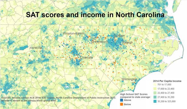
Maps of North Carolina high schools’ SAT scores show a strong relationship to the income of the schools’ neighborhoods. The map above shows the state’s public and charter high schools, color-coded as having SAT scores above or below the state average. The underlying map shows per capita income by census block group. (Click here to download a PDF of map above for clearer viewing) There are exceptions to this pattern of higher-income areas with higher SAT scores, but geographic income patterns align very well with schools’ scores.
The dashboards below allow for detailed exploration of the state map as well as comparison of districts’ high schools to the state distribution of scores. (Continue reading article below dashboard.)
Clusters of above- and below-average scores are visible in the metros and correspond closely with incomes. An example is in high-income areas north and south of Charlotte, which contrast with the lower incomes in the center of the city. The same pattern is clear in the state’s other large cities. More broadly, the coastal plain east of Raleigh has wide areas of lower-income and below-average SAT scores. Pockets of higher-income areas along the coast and in the mountains also contain many with above-average scores. Use the zoom tools on the state map to get a closer look at the pattern.
Use the “un-pin” map tool to return to the state view, or use the “revert” icon at the bottom center of the dashboard to go back to the original view. Select any school, or group of schools, on the map to see data for those schools in the table below the map.
There are certainly exceptions to the income/SAT score pattern as you look closely at the map. Often, magnet or special programs buck the trend with above-average scores in lower-income areas.
The second tab in the dashboard above shows high schools by public school district in the state. The bar graph to the left shows the distribution of all North Carolina high schools’ SAT scores for 2013 from highest to lowest. The color in the graph incidicates whether an individual school’s average score is above or below the state’s average score for that year. By selecting a district, such as Charlotte-Mecklenburg, you see high schools from that district (excluding charters) also arranged from highest to lowest score. Select any school and choose to highlight where that school falls in the bar graph, or where the schools in the district are distributed across all those in the state.
While this pattern of income and SAT scores will not surprise experts who study these trends, the stark differences seen in the map are a reminder of the educational challenges facing low-income areas.